Data Visualization Posters

These data visualization posters are representations of food waste that is generated across the stages of the value chain, where it is generated the most, and how both manufacturers and consumers can aid in the efforts to reduce food waste. The format of each poster is similar, but they differ in their focus of content. Together the posters convey the magnitude of what is wasted while simultaneously educating readers on what they can do to help aid in food waste reduction.
Role
Student – University of Houston
Categories
Infographics // Data Visualization // Print Design

Food Waste & The Manufacturing Sector

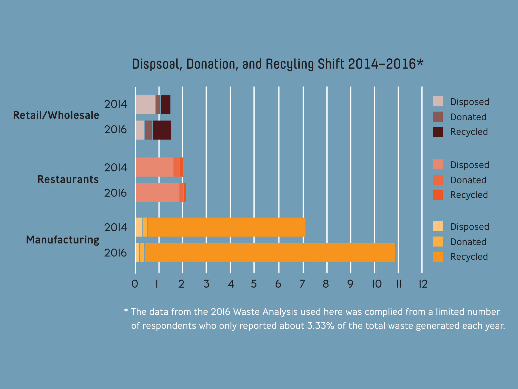
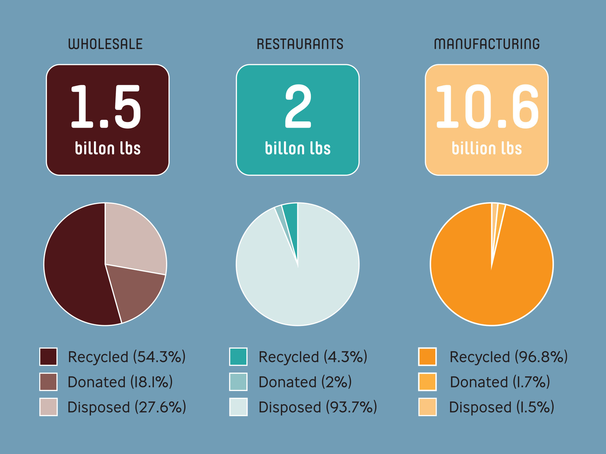
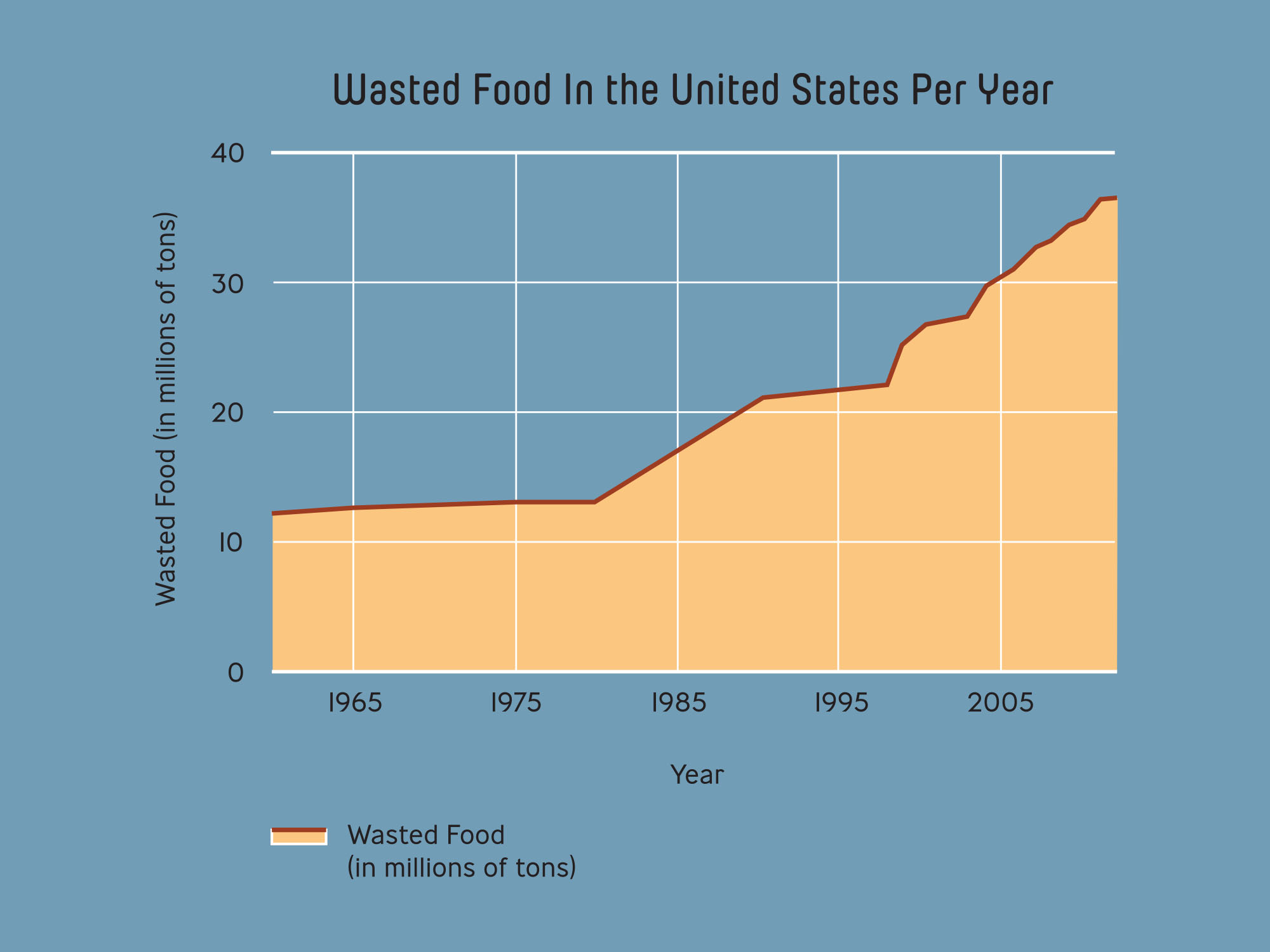
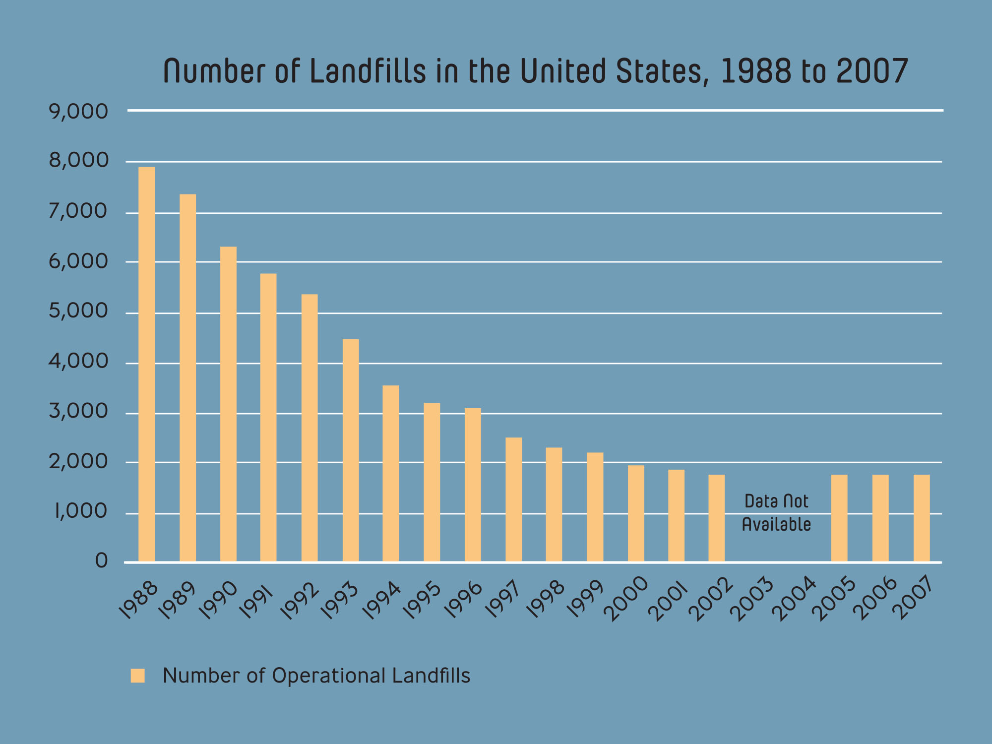
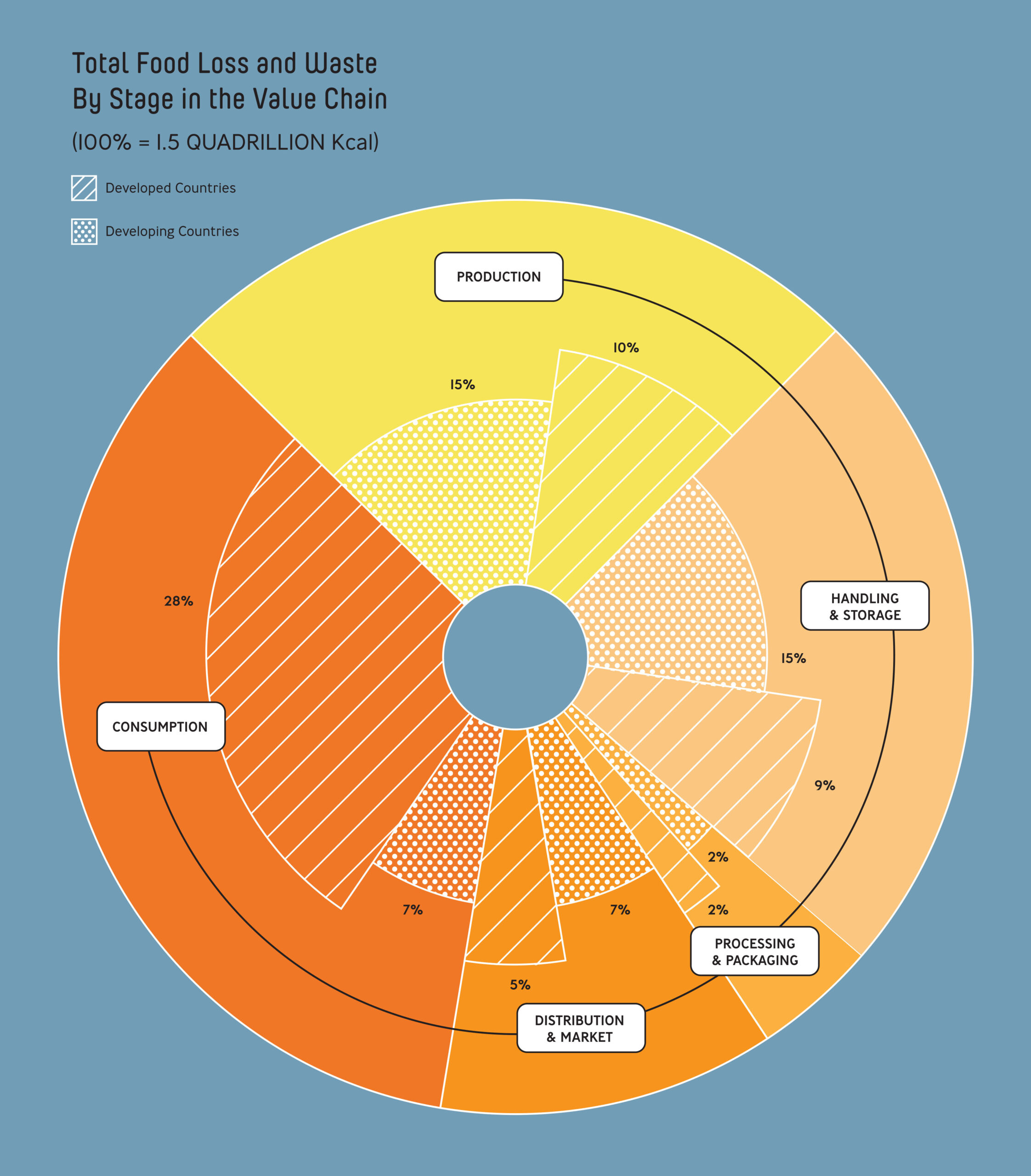
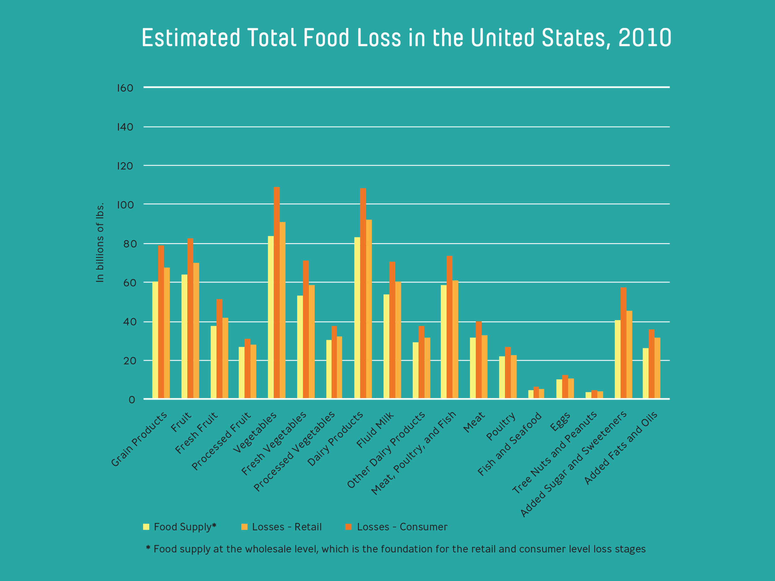
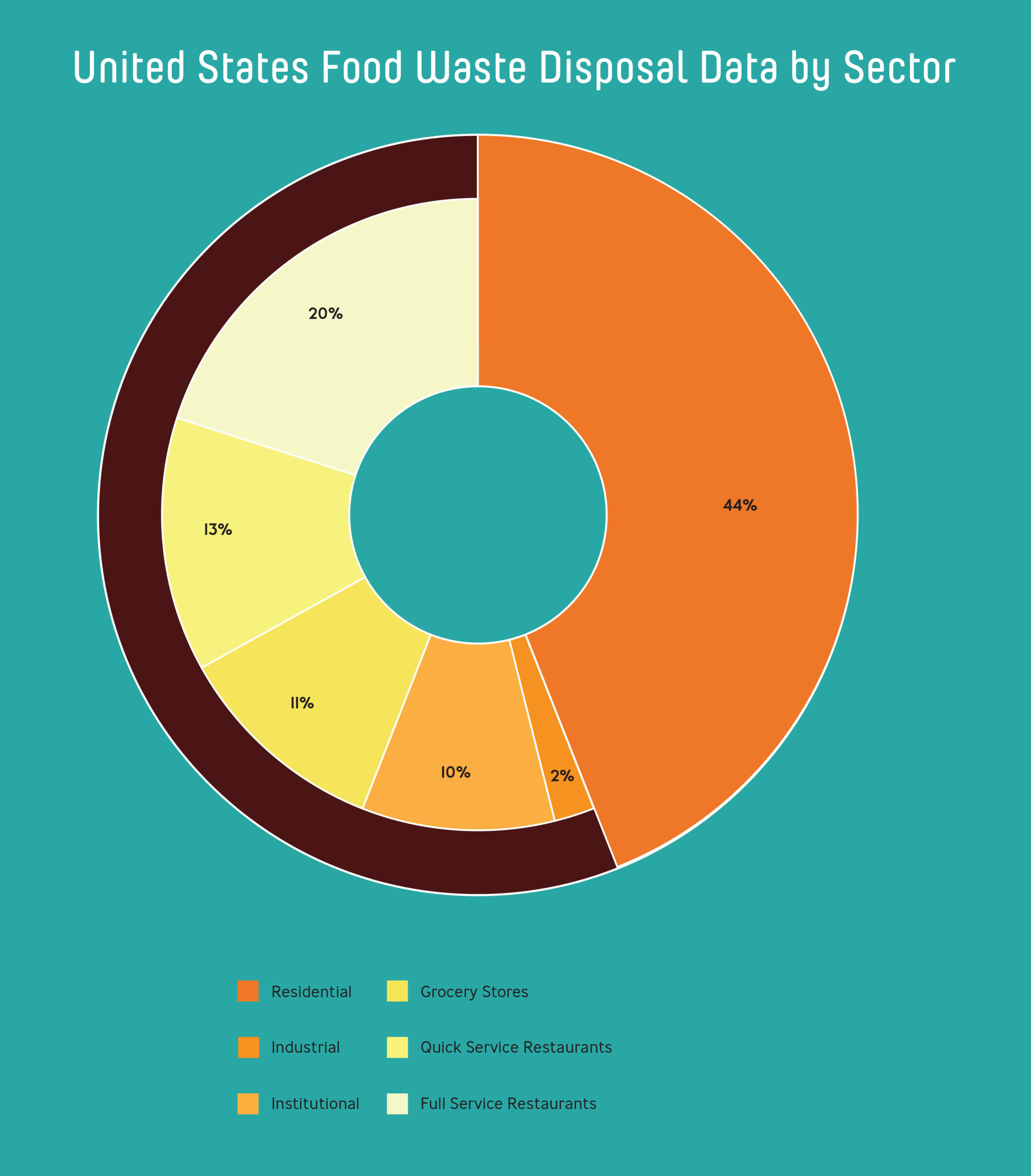
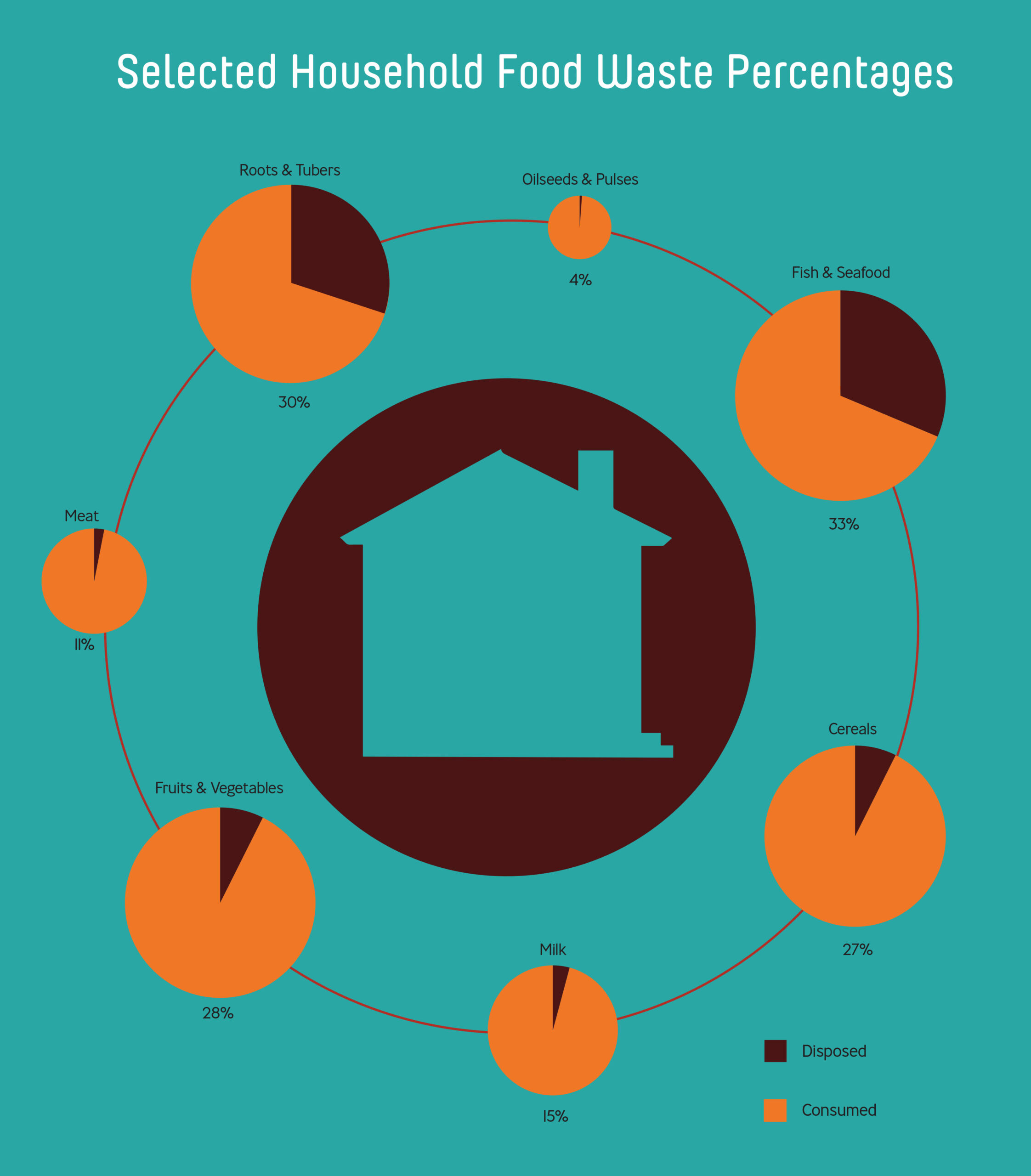
The first half of the set focuses on food waste in the manufacturing sector. The infographics highlight data of the disposal, donation, and recycling rates of food waste in this sector within the United States, the number of stateside landfills, as well as the total global food loss tracked through what the sector calls the value chain.

Consumer Waste & How It Can Be Reduced

The second half of the set outlines the various ways food is wasted by consumers, and how consumers can better shop for and utilize the food they purchase. Data charts on this end show the wastage/spoilage rates for the United Kingdom (as data in the U.S. was unavailable in 2017), food waste comparisons from other sectors to the consumer market, and household expenses and wastage.

Side-by-Side Comparison